Card
Card is a container for grouping related content and actions.
Installation
npx jsx-daisyui add cardDefault
card-default
Card Title
A simple card with a title, body text, and action button.
With image
card-image
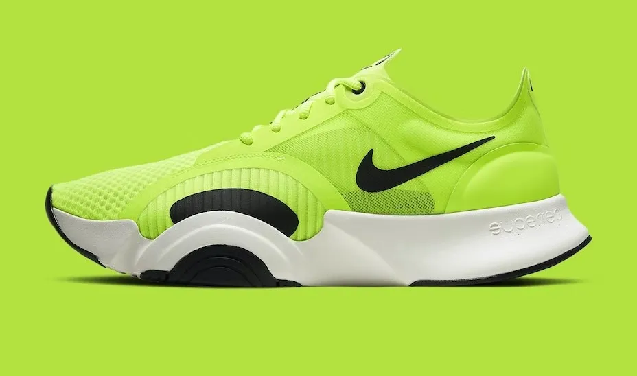
Classic Sneakers
If a dog chews shoes whose shoes does he choose?
Side layout
card-side
New Arrivals
Click the button to listen on Spotiwhy app.
Variants
card-variants
Shadow
Default shadow card.
Border
Bordered card variant.
Dash
Dashed border card.
Centered
card-centered
Congratulations!
You have been selected for a special offer.
Props
Card
| Prop | Type | Default | Description |
|---|---|---|---|
size | 'xs' | 'sm' | 'md' | 'lg' | 'xl' | 'md' | The size of the card. |
variant | 'shadow' | 'border' | 'dash' | 'shadow' | The visual style of the card container. |
side | boolean | - | Displays image on the side (horizontal layout). |
imageFull | boolean | - | Makes the image fill the card and places content over it. |
Card.Body
| Prop | Type | Default | Description |
|---|---|---|---|
centered | boolean | - | Centers text and content inside the body. |
Card.Actions
| Prop | Type | Default | Description |
|---|---|---|---|
justify | 'start' | 'center' | 'end' | 'end' | Justification of the action buttons. |
Card.Figure
| Prop | Type | Default | Description |
|---|---|---|---|
src | string | - | URL for the image. If provided, renders an <img> tag. Otherwise, renders children. |
alt | string | - | Alt text for the image. |